BitGo Brand and Design System
How do you create a brand and website for a company, building an entire market for an emerging and evolving industry, for a persona that is undefined and unstudied?
You also only have eight months to complete it in a big reveal for a trade show :)
I was given an opportunity to create a brand and experience where I had blank slate, a good budget, sole approval and top-level commitment to do what I needed to do. Since there was no prior research at the company or in the industry at all, much of what I did was truly foundational. Using research and data, I transformed a niche cryptocurrency wallet SaaS company into a financial services company with full design department and a unified look and feel across the marketing and product.

Analysis / Research
First, we had to start with the basics questions: Is the user the same as the buyer? Who are we competing against? Why? What does our competitor have that we don’t? How do we collect information in the first place?
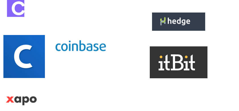
Competitive research and heuristic evaluations were made across both the crypto industry as well as traditional finance on visual/UX design, architecture and messaging across both the marketing presence and products.
After contacting research agencies and universities far and wide, we realized there was very little information out there around the big finance digital asset market—because the market hadn’t actually happened yet. Us skating to where the puck was going meant doing the ALL of the research on our own.
Getting to talk to the C-level titans of finance—who through our research we found out were our product users—was not going to be easy or cheap. And we were turned down by almost all recruiting firms, so we had to get scrappy.
In the end, we took a Salesforce play and did the recruiting ourselves at trade shows and events. By talking directly to our users there, we were free to get creative on incentives and recruitment methodology as well as create a relationship for the future.
The Content Strategy and Creation
Once we had established who we are talking to and what needed to be said, we knew we had to produce ALOT of content—not only for the external website but all documentation around the products and features.
I brought on several writers and content strategists to interview, document and capture all the information that was in the heads of the CEO, CTO, VPs, Engineers, Sales, Support and beyond, while collecting, indexing all artifacts that would be the basis for BitGo’s content. This was done in a series of content discovery workshops that allowed the stakeholders to simply talk about the BitGo products and services and we guided them to answer key areas and provide all the content, including areas of interest in RandD and new developments in the space to generate ideas and outlines for writers to expand on later.
Design and Build
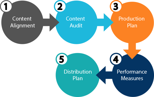
We selected the content management system (CMS) and started defining key flows around Sign in/Sign up/Contact us and we started building the information architecture for each section on the site.
From our content discovery sessions, we identified key products and features that we would develop the Marketecture and ultimately marketing materials, as well as onboarding guides, tutorials and help topics for distribution.
I wire-framed out all baseline templates for pages and identified components to be shared across all the sites to use, and created a design system and library to be used to create all the pages and experiences.
Each page was wire-framed and a content matrix was completed that was mapped to the new website information architecture. I then created an Invision prototype for quick reference for the visual design phase that would be handed off to the agency selected to create the visual design system that needed to be scaled out and adapted across the company.
Creating a Silicon Valley Financial Services Brand
The visual brand had to do several things—look like a traditional finance company that investors would see as safe, stable and established, but also contemporary with a nod back to its cryptocurrency roots.
We wanted a blend between the traditional wall street/corporate finance that our customers and user were used to and the Silicon Valley tech that was in our DNA.
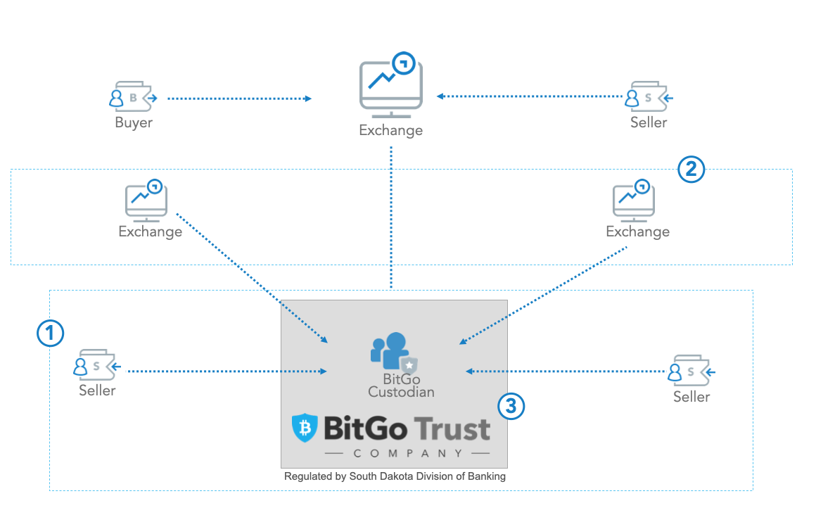
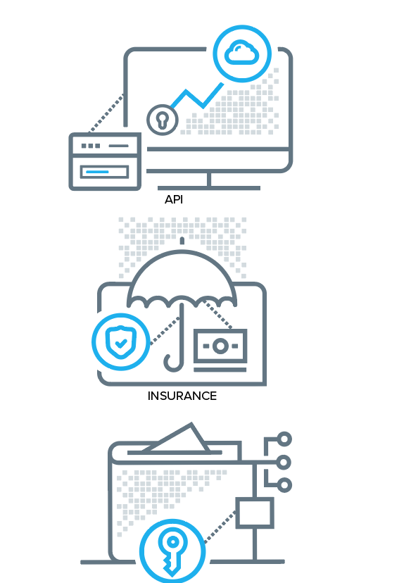
One challenge of the brand was the lack of product shots that were available. I joined BitGo at a time of great evolution and the product itself was not something that was visually appealing, and certainly not anything I would use to advertise or sell the benefits and functions of the platform. We had to come up with visual elements to communicate the various concepts and functionalities of the product.
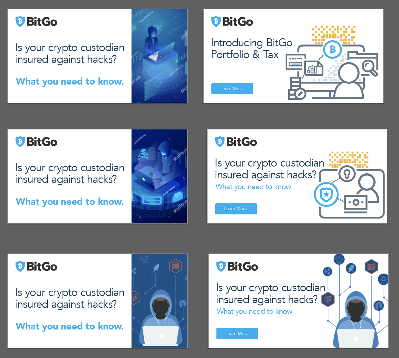
Another thing that really stuck out in my review of branding from the traditional finance side (other than it being terribly dated) was the over use of stock photography that had a tendency to really cheapen the presentation and make the entire brand look cheesy. I opted to create a series of product icons that could be used throughout the brand to give an overall understanding of broad concepts without being specific or distracting from the message.
Lastly—although the brand itself was going through an overhaul, the BitGo logo was out of scope. The logo itself was dated, cliche, and was worse than a 99-design contest entry ( yes, we ran one in an attempt ) , but the ORG was resistant to changing it. As the logo was badly in need of design but was going to be a process to overhaul in practice, we knew we needed to develop other hero branding elements that would have been typically inspired or borrowed from it.

Through a series of working sessions, we decided the brand needed a unifying element that could communicate the brand concepts: blockchain, digital bits, security and motion. The ribbon was created to use as that element, and serve a subtle anchor for all of the different channels that BitGo would develop and could be iterated on later.
We selected an agency to provide us the basic styling of the key flows and sections we defined. To reduce costs I brought on a cross functional team of 10, comprised of Creative Directors, Visual Designers, Developers, Animators, and Front-End Magicians to layout and implement the rest of the pages.
The design system gave life to the wireframes, and the design system we create scaled across the company and drove the visual and written brand and design in the product to give BitGo a cohesive and professional look and feel. We worked with the CEO and other stakeholders to arrive at the perfect blend between a modern bank and our competitors in the blockchain space. As we could not really identify with either of the existing paradigms, we had an opportunity to blend the two regions of Silicon Valley and Wall Street.
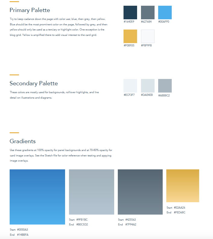
The blue colors were to establish trust and security. This color is common in the financial world and was closely aligned to the existing blue in the logo. We then chose different shades of blue and grey to compliment them and topped the color palette off with a bright golden yellow for accent colors to be used sparingly.
The Result
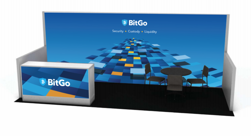
We delivered an entire business and brand system including custom icon sets, presentation templates, website design systems, trade show identity, swag and more. This transformation propelled BitGo into another league and introduced the world to a new blockchain financial services company that now was seen as competitive in the market.